This is the first in a monthly series of posts sharing and discussing statistics on the Deflect network. March 2016 was a busy month for us. We began to publish analytic reports on DDoS attacks against some of the clients we protect on the network. Our aim is to help the target’s advocacy efforts and begin strip away at the impunity currently enjoyed by botnet operators. As our analytic tooling and understanding of these attacks improve, so will the reports.
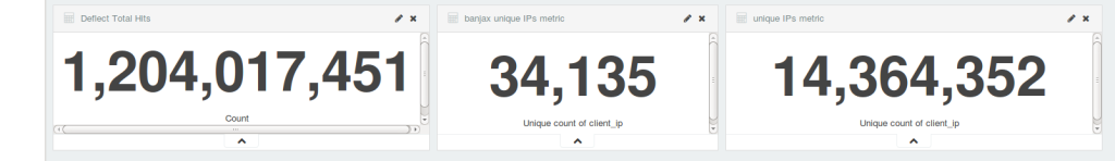
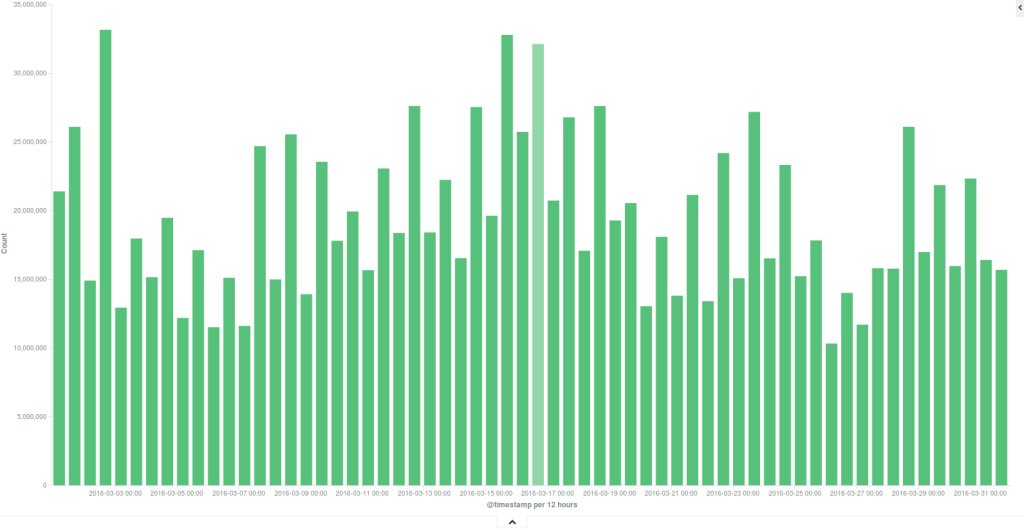
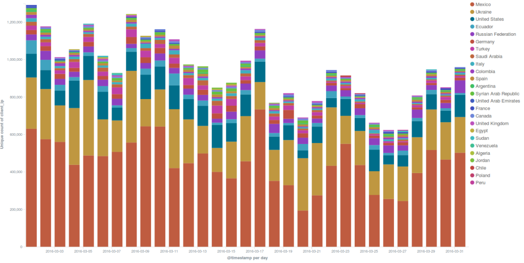
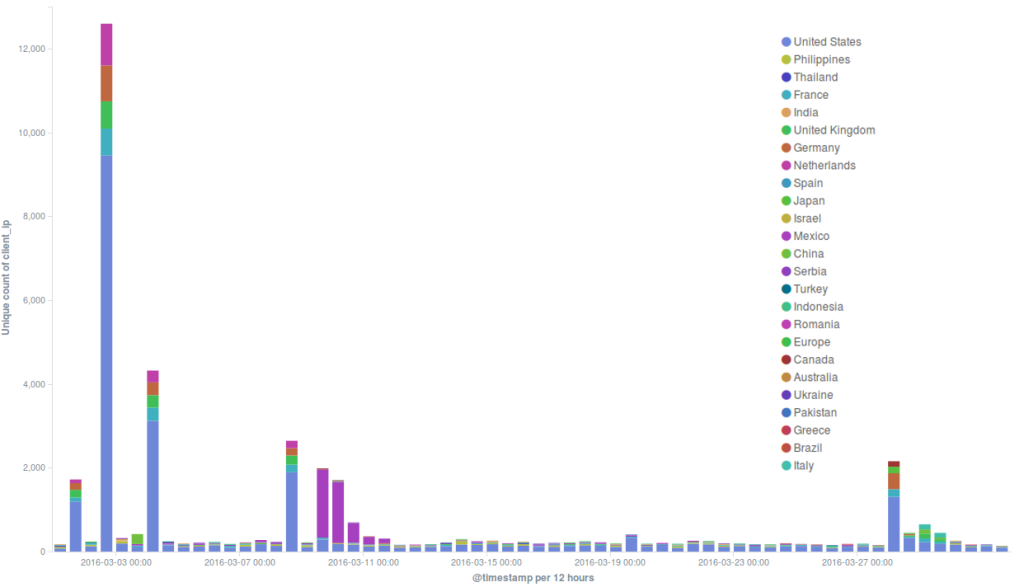
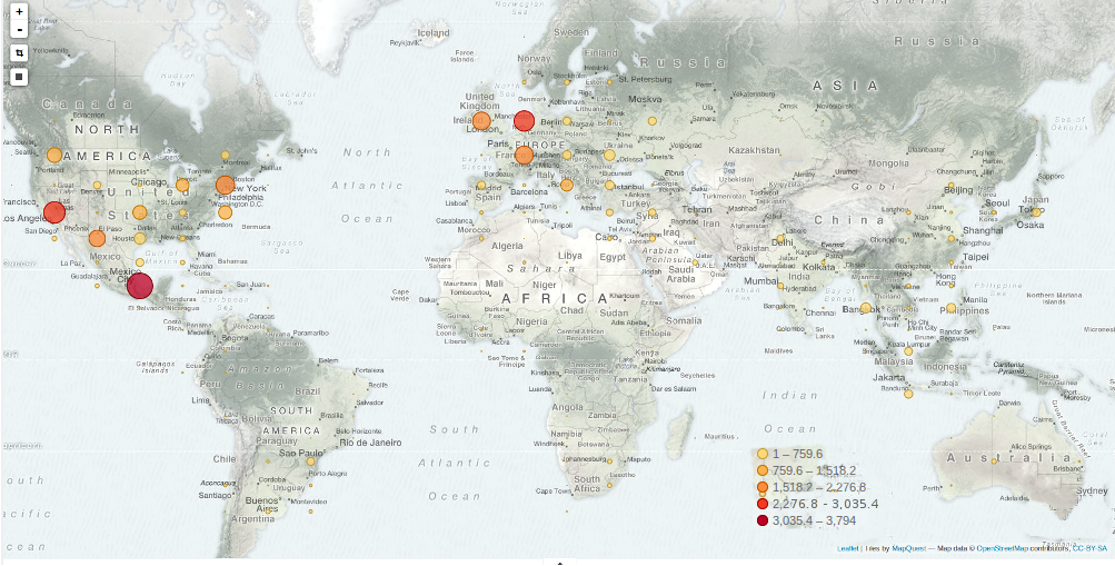
In terms of people served and traffic on the network, this was our busiest month to date. We averaged around 20 million daily hits, a significant percentage of which came from readers in Mexico. Around ten separate DDoS incidents were recorded during the month, of various strength and sophistication.
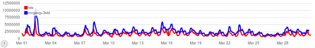
Attacks on the Deflect network in March 2016
Around a dozen separate incidents were recorded on the network in March. It’s important to note that these are requests that triggered our banning mechanisms. In reality there may have been many more malicious requests.
We are also beginning to track botnets as anomalies on the network. Herein a graph built using the Timelion toolkit for ElasticSearch. It consists of time-series based representation of total hits on the network (red line) and a moving average (blue line) – specific browsing patterns as generated by readers behavior week upon week. We then multiply the blue line values by 3 so we can clearly see when an anomaly is happening on the network. Most of the time, although not every-time, the anomaly represents a spike in traffic or hits on websites – an attack.
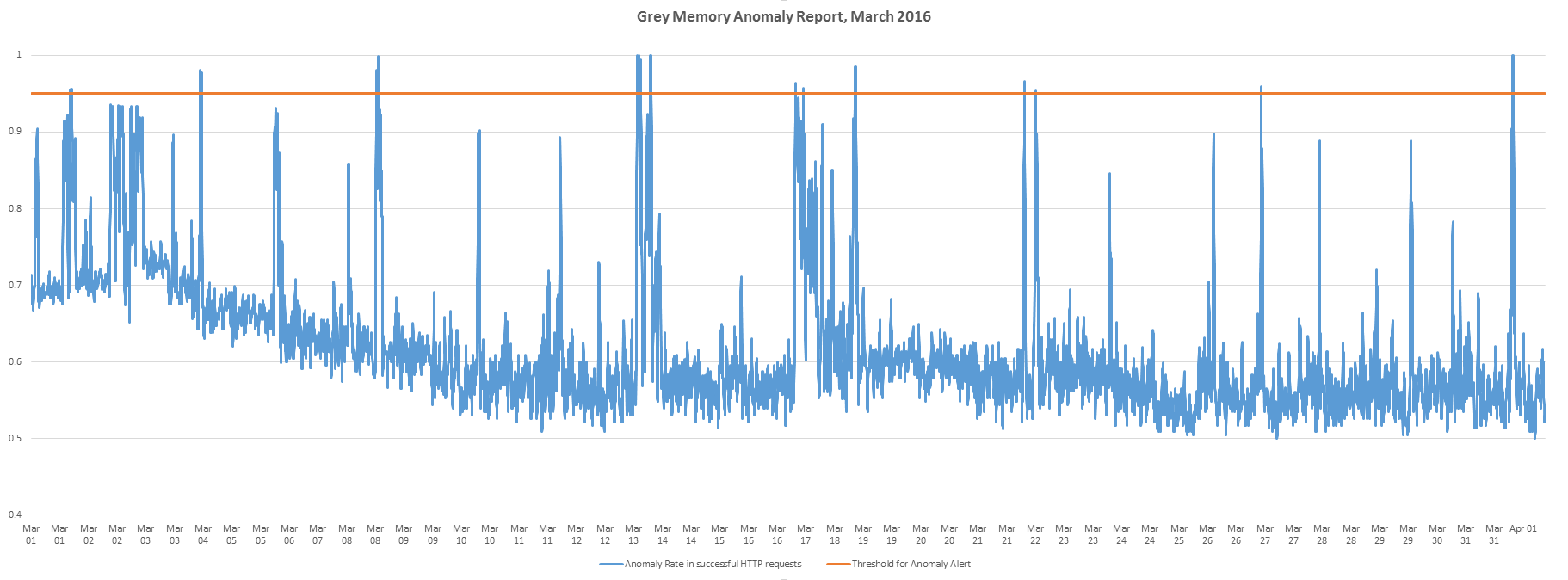
We have also been contributing towards the development of a tool called GreyMemory. It is an anomaly detection tool which accepts any multi-dimensional time series as input, then predicts the next state of the system, measures the error of prediction and generates an anomaly rate. It uses predictive algorithms to evaluate what might happen next on the network, and compares this evaluation with the eventual result. If the quality of prediction drops, it alerts the anomaly. On the following diagram GRAY is the ratio of successful HTTP requests divided by the total # HTTP requests; BLUE is the anomaly rate, as calculated by GreyMemory and ORANGE is the anomaly Alert, where we should create incidents. Alerts are triggered when anomaly rate exceeds a threshold, which is currently on 95%
